
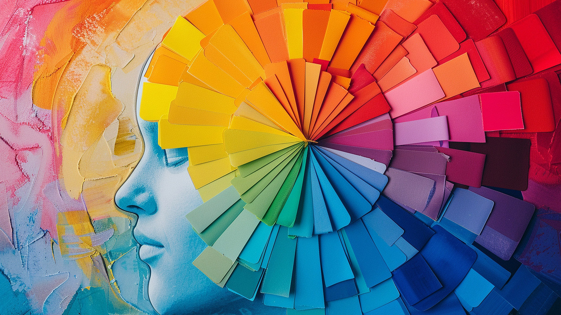
Have you ever wondered why certain ads or websites seem to grab your attention instantly while others don’t? The secret often lies in something as simple as color. Many businesses overlook the impact that color psychology can have on consumer behavior, yet it plays a crucial role in the effectiveness of your digital marketing. A well-designed marketing campaign that leverages the right colors can create emotional connections, influence buying decisions, and boost engagement. But when the colors clash or don’t align with the brand’s message, it can have the opposite effect. This is where understanding color psychology becomes a game changer for your digital strategy.
Color isn’t just decoration—it’s a powerful marketing tool that can subtly guide consumer decisions. Different colors evoke different emotions, affecting how people feel about your brand and what actions they take next. For example, blue often communicates trust, which is why banks and financial institutions frequently use it. By carefully selecting your brand’s color palette, you can align consumer perception with your brand’s core message. Ready to dig deeper into this fascinating world? Let’s explore how color psychology can transform your digital marketing success. For more creative design strategies, check out some effective solutions here.
The Power of Color in Digital Marketing
In digital marketing, color is more than just an aesthetic choice—it’s a strategic element that can significantly influence user behavior. The right colors can evoke specific emotions, set the tone for your brand, and even drive conversions. Neglecting this key factor may mean losing out on valuable customer engagement.
Creating Emotional Connections with Color
Colors evoke emotions that can have a direct impact on how users perceive your brand. Warm colors like red and orange stir feelings of excitement or urgency, while cooler tones like blue and green promote calm and trust. By aligning your color scheme with the emotions you want to evoke, you can create deeper connections with your audience.
Color and Brand Identity
Consistency in your color palette is crucial for brand recognition. Using the same colors across your website, social media, and ads reinforces your brand’s identity and strengthens its presence in the minds of consumers. A strong, unified color scheme enhances trust and makes your brand more memorable.
Driving Conversions Through Color
The colors you use in your calls-to-action (CTAs) can dramatically influence click-through rates and conversions. For example, using bright, contrasting colors like red or orange for CTA buttons helps them stand out and encourages users to take action. The right color choice can be the difference between a passive viewer and an active customer.
How Different Colors Affect Consumer Behavior
Each color has a unique psychological impact on consumers. By understanding the emotions and associations behind different colors, you can better target your audience and influence their decisions. Let’s take a look at how key colors impact behavior.
Blue: Trust and Reliability
Blue is often associated with trust, security, and reliability. It’s a popular color choice for industries like finance, healthcare, and technology. Brands use blue to create a sense of stability and professionalism, reassuring consumers that they are in safe hands.
Red: Urgency and Passion
Red is a powerful color that evokes feelings of urgency, passion, and excitement. It’s commonly used in clearance sales or promotional campaigns to prompt quick decisions. However, red can also be overwhelming if overused, so it’s important to balance it with other colors.
Green: Balance and Growth
Green is a calming color that represents nature, balance, and growth. It’s often used by brands focused on sustainability, health, and wellness. Green gives consumers a sense of freshness and renewal, making it ideal for eco-friendly and health-conscious brands.
For more tips on utilizing color in your digital marketing strategy, check out these additional insights on design tactics that can boost your campaign’s effectiveness.
Why Color Psychology Matters in User Experience
Beyond branding and emotional impact, color plays a key role in user experience (UX). A well-thought-out color scheme can guide users through your website smoothly, enhance readability, and even improve accessibility. Ignoring this could result in poor user engagement and missed opportunities.
Guiding User Flow with Color
Colors help guide users to specific actions or areas of interest. By using contrasting colors for buttons or important sections, you can draw attention to the elements that matter most. This not only enhances the user experience but also increases the likelihood of conversions.
Improving Readability and Accessibility
Color contrast is critical for readability, especially for users with visual impairments. High contrast between background and text ensures that your content is easy to read for all audiences. Good design considers accessibility, helping your site reach a wider demographic.
Creating a Positive First Impression
The first thing users notice when they land on your site is its visual design, and color is a major part of that. A thoughtfully chosen color scheme can create a positive first impression, encouraging users to stay on your site longer. This increased engagement often leads to better retention and conversion rates.
To ensure your brand uses color effectively, consider integrating expert creative design solutions into your strategy. This can dramatically improve your digital marketing outcomes.
If you’re ready to transform your digital marketing strategy using the power of color psychology, follow me for more insightful content and practical tips. Make color a core element of your strategy, and watch how it enhances your results.